.jpg)
It's been a bit of a weird road getting here, but please follow me for a second. About a week ago, a mysterious countdown timer appeared on the Capcom website. We assumed a game would be announced when it reached zero, but knew little else. Given the numerous rumours that a Resident Evil 4 remake was in the works, many thought it was that. They were wrong.
Yesterday - 21 February at 6am GMT - the countdown reached its conclusion. The gift that Capcom blessed us with at the end of all of that was Street Fighter 6. We weren't given much info - but what we did know is that Papi Ryu is going to be a big wide boy, and that the logo looks like something the intern knocked up on lunch.
Want to see the logo reveal for yourself? It's here in the Street Fighter 6 teaser trailer.
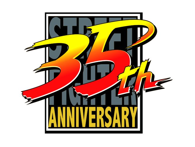
Yes, the logo, which looks like the designer was attempting to start a genericism movement, looks very basic. The design decision is really sort of baffling when you compare it to the bombastic logos which have come before it. Even the Street Fighter series' 35th anniversary logo, which was designed this year, has a lot more flare to it - and it's not even being put into a specific game.
Advert
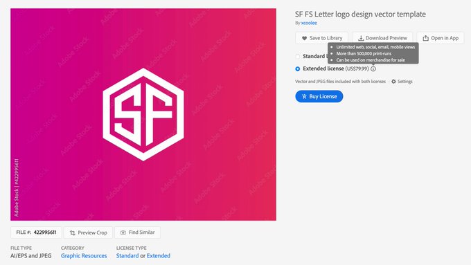
Now, the creative director of Ars Technica, Aurich Lawson, has discovered something very spicy. The logo looks surprisingly like one you can purchase for $80 on Adobe's stock site. The logo comes in pretty much every configuration of letters. We've seen this style of logo everywhere, from Scooby Doo's collar, to another developer System 3, to a very similar one that's being used by Connexion, a sci-fi convention in France.
It's very unlikely, of course, that the logo Capcom is using for Street Fighter 6 was purchased. There are some differences. The corners are rounded, there is a wear and tear effect added, and of course there's the bit reminding you that you have six unread messages. However, the fact that so many people are calling the game's logo out as not only being painfully out of keeping with previous Street Fighter games, but also incredibly similar to a generic stock image, doesn't make for a promising start to the next entry in this famous fighting franchise.
Advert
Whether Capcom decides to change the logo or not remains to be seen, but the developer has said there is more information on the game coming in the summertime, by which we assume the period around E3. Fighting game fans will no doubt get over something as relatively trivial as a logo if the game itself is great... right?
Featured Image Credit: Capcom / NBCTopics: Capcom